
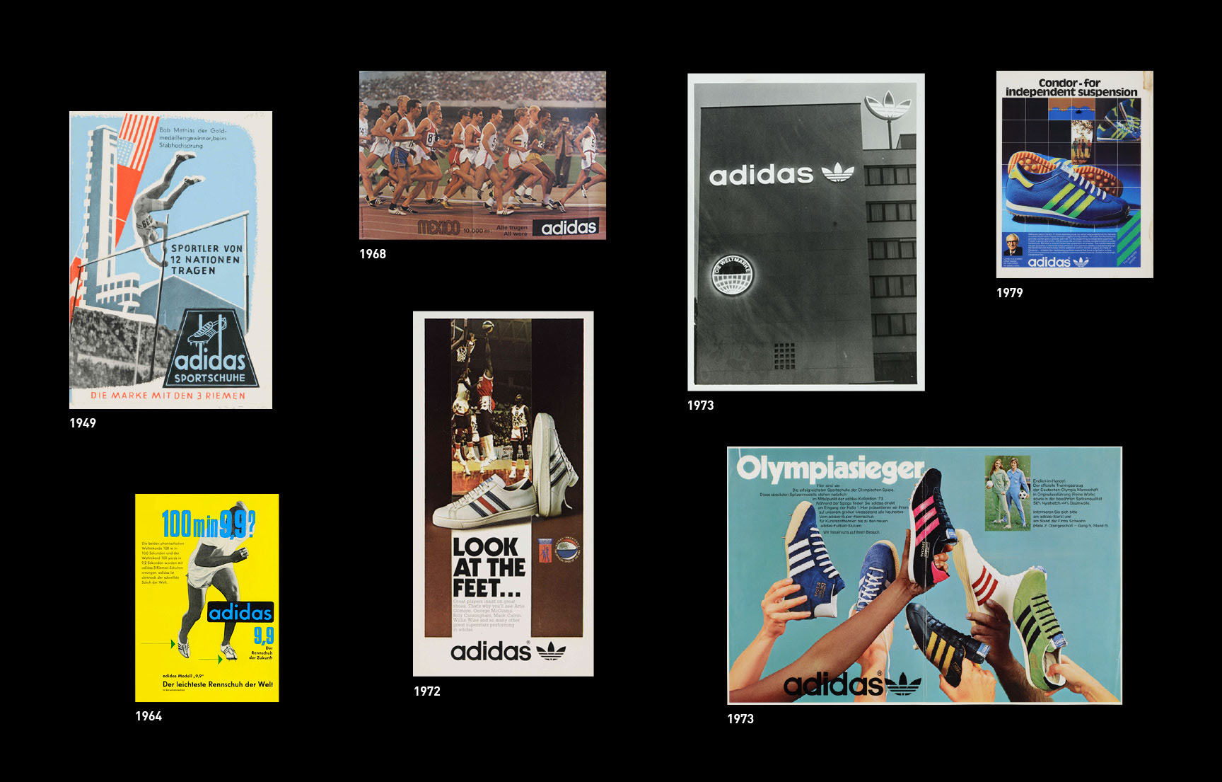
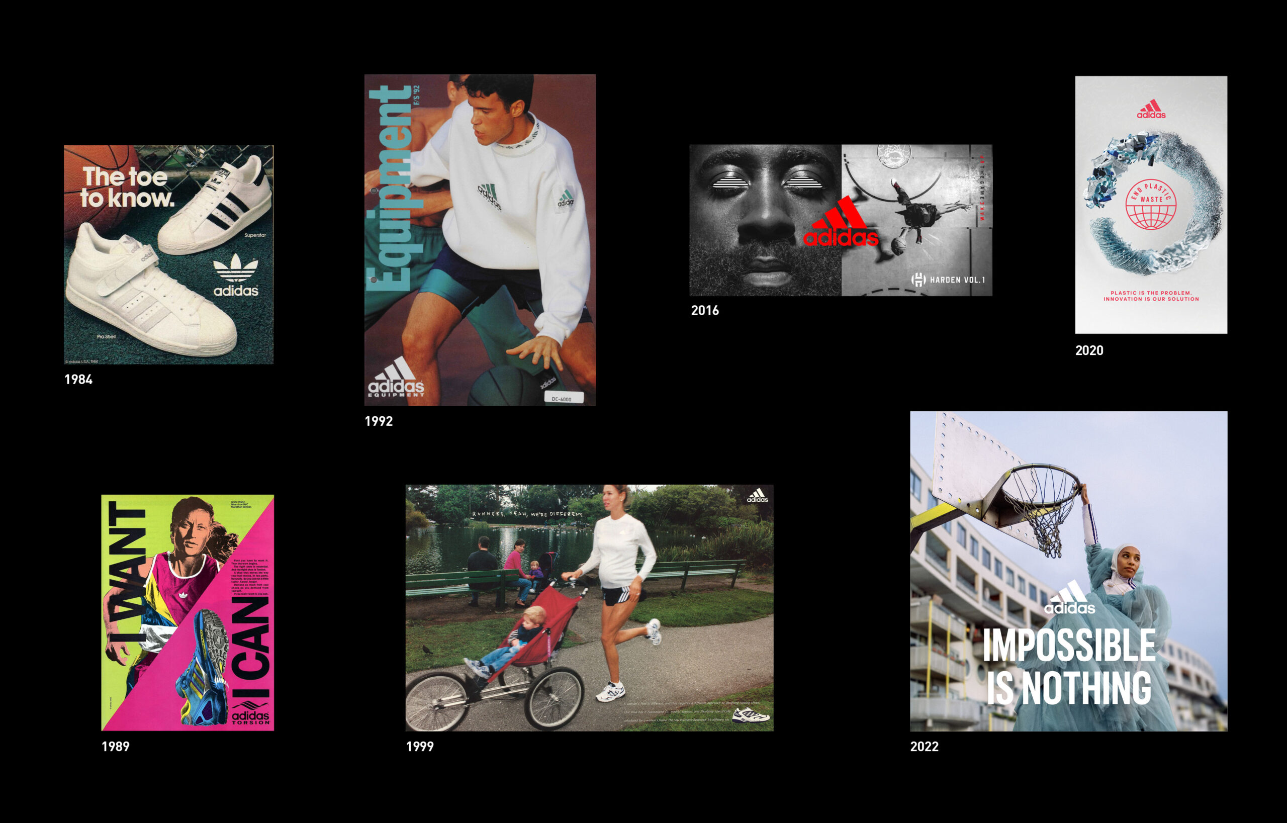
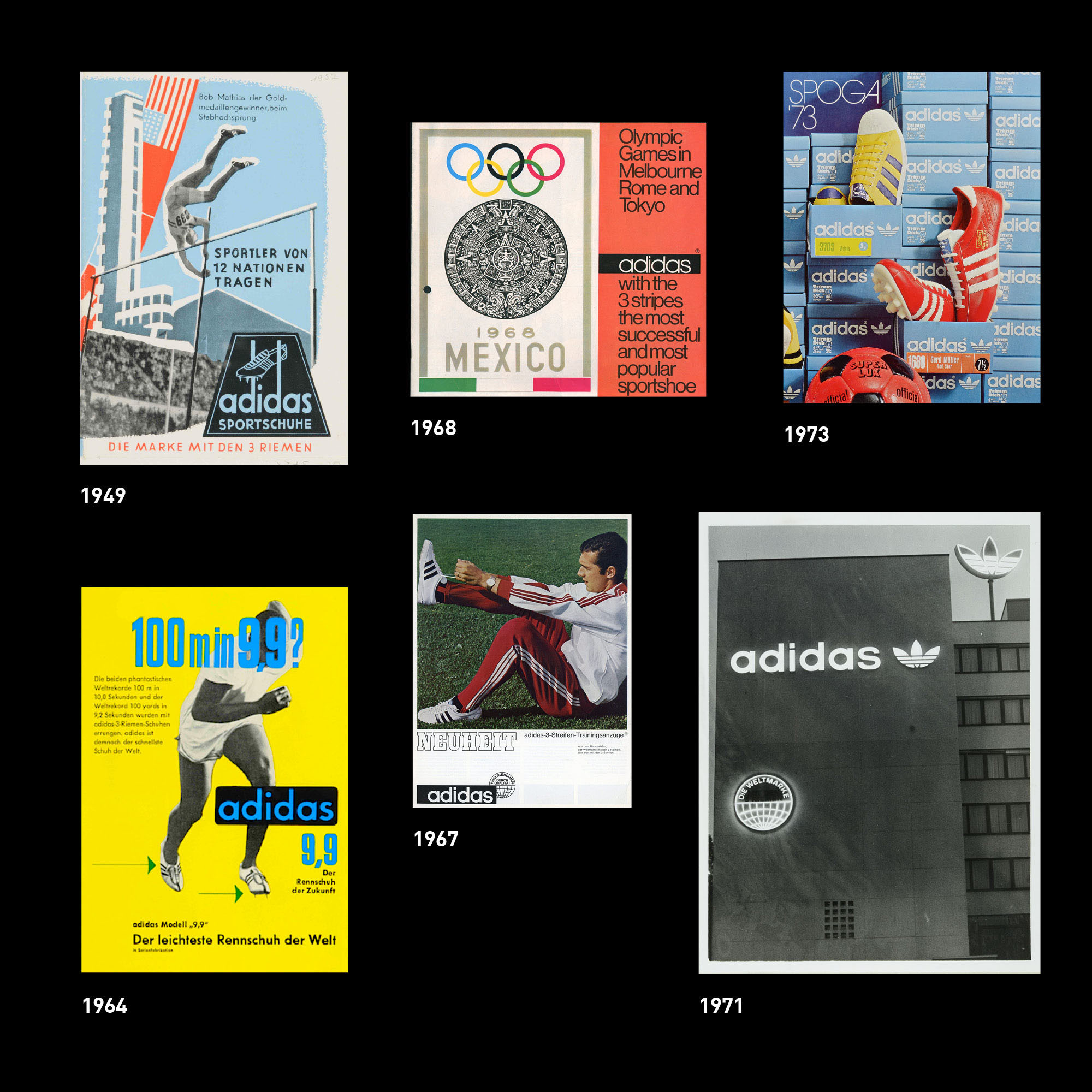
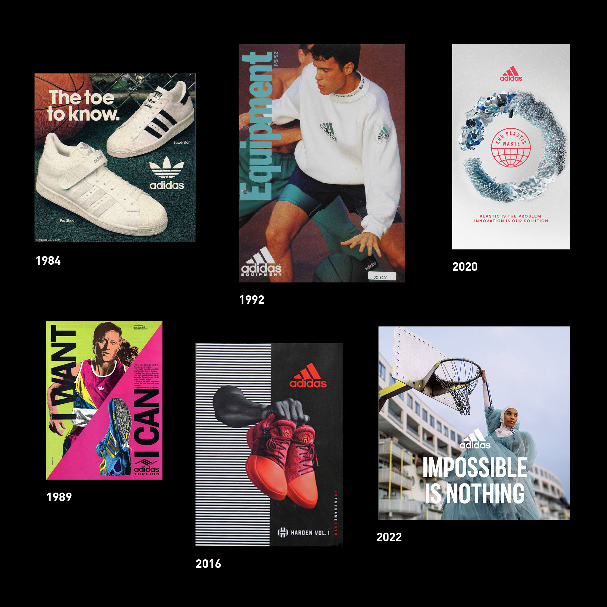
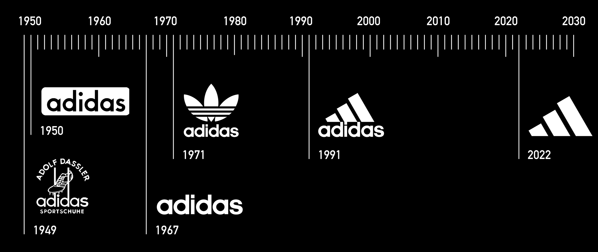
From humble beginnings in the small town of Herzogenaurch, Germany, to the global stage, adidas has become one of the most beloved sports brands in the world. Over the past 70+ years, adidas has continually evolved its brand marks, establishing some of the most iconic graphics in sport and culture.
With this constant evolution, the brand structure started to become stressed and was in need of redefining its core identity. Our goal was to modernize the main brand mark and its system to meet the needs of both physical and digital applications while continuing to build on the visual story that is undeniably adidas.
Brand Identity
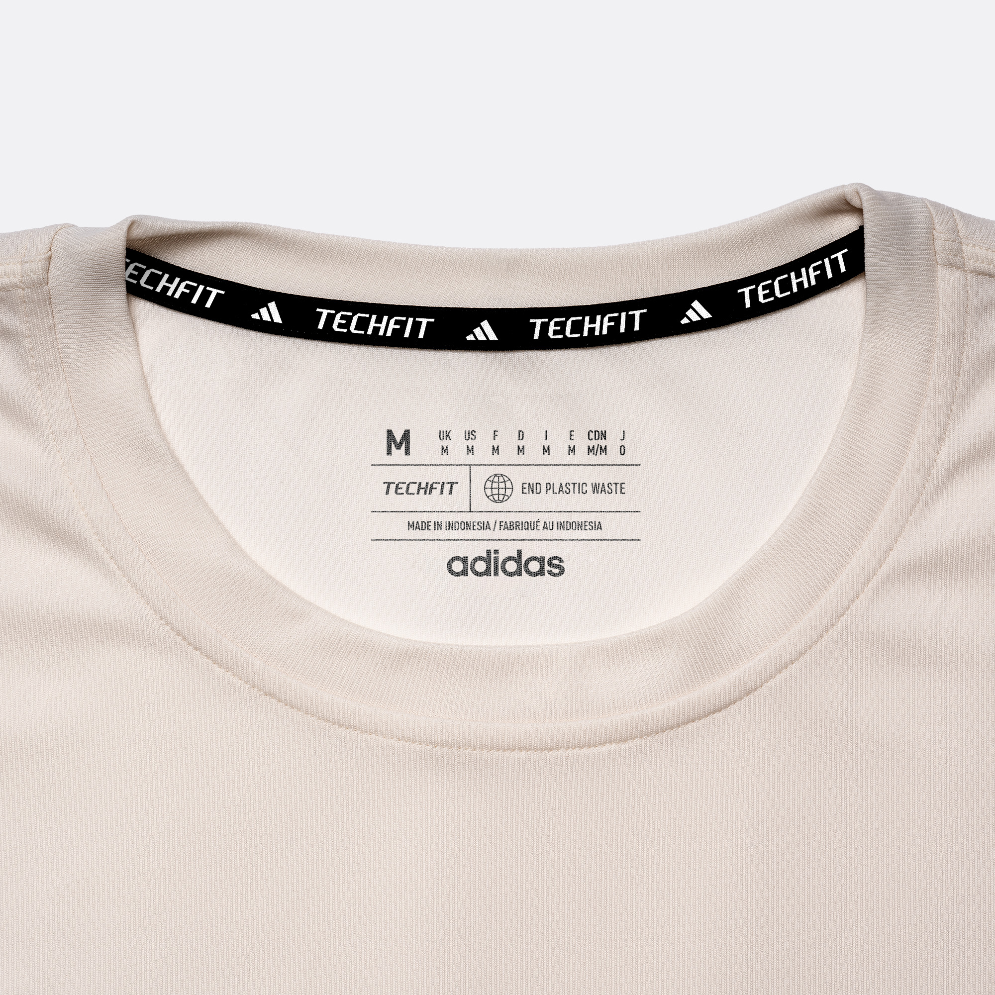
Standards & Guidelines
Labels & Trims
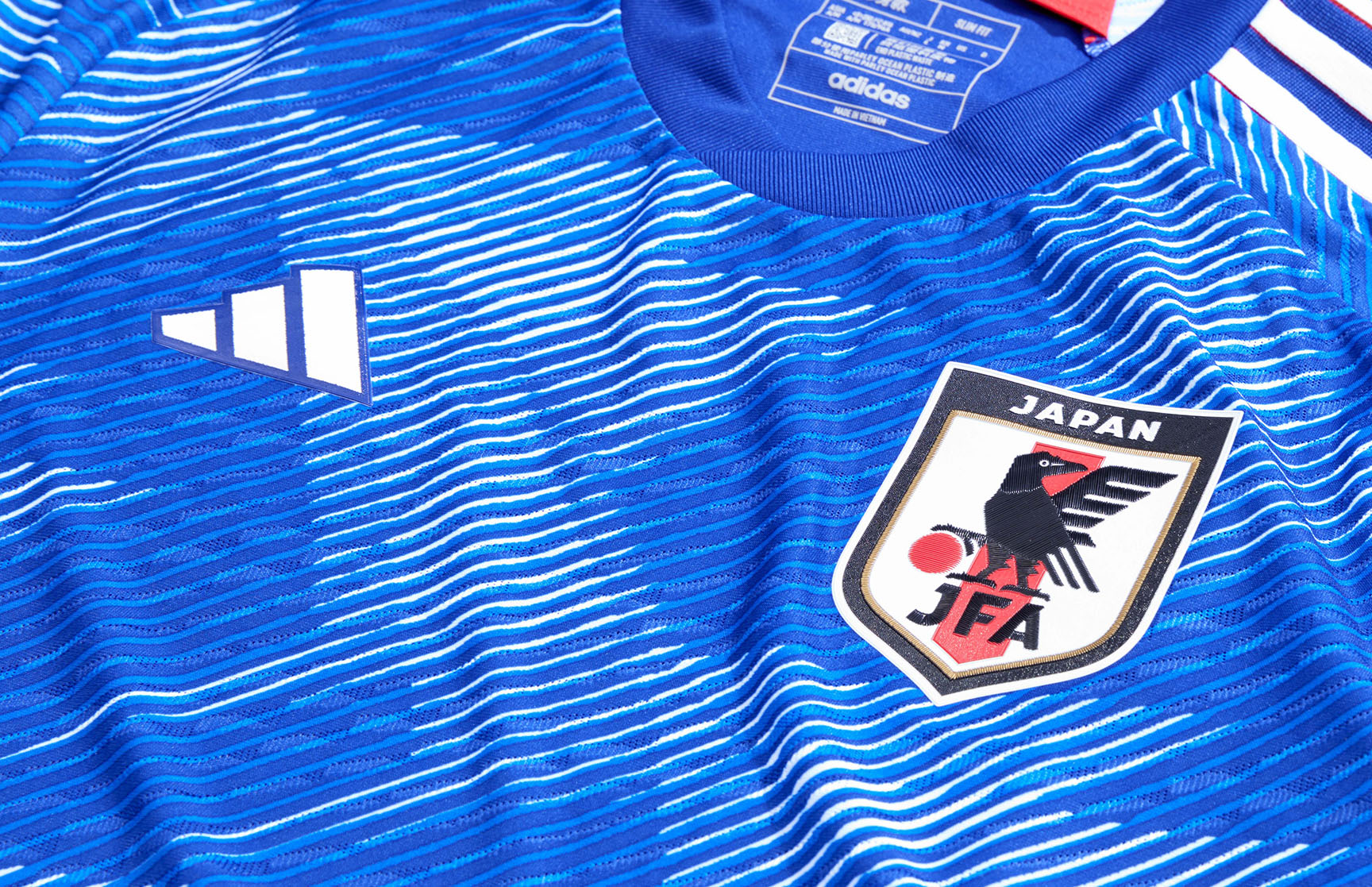
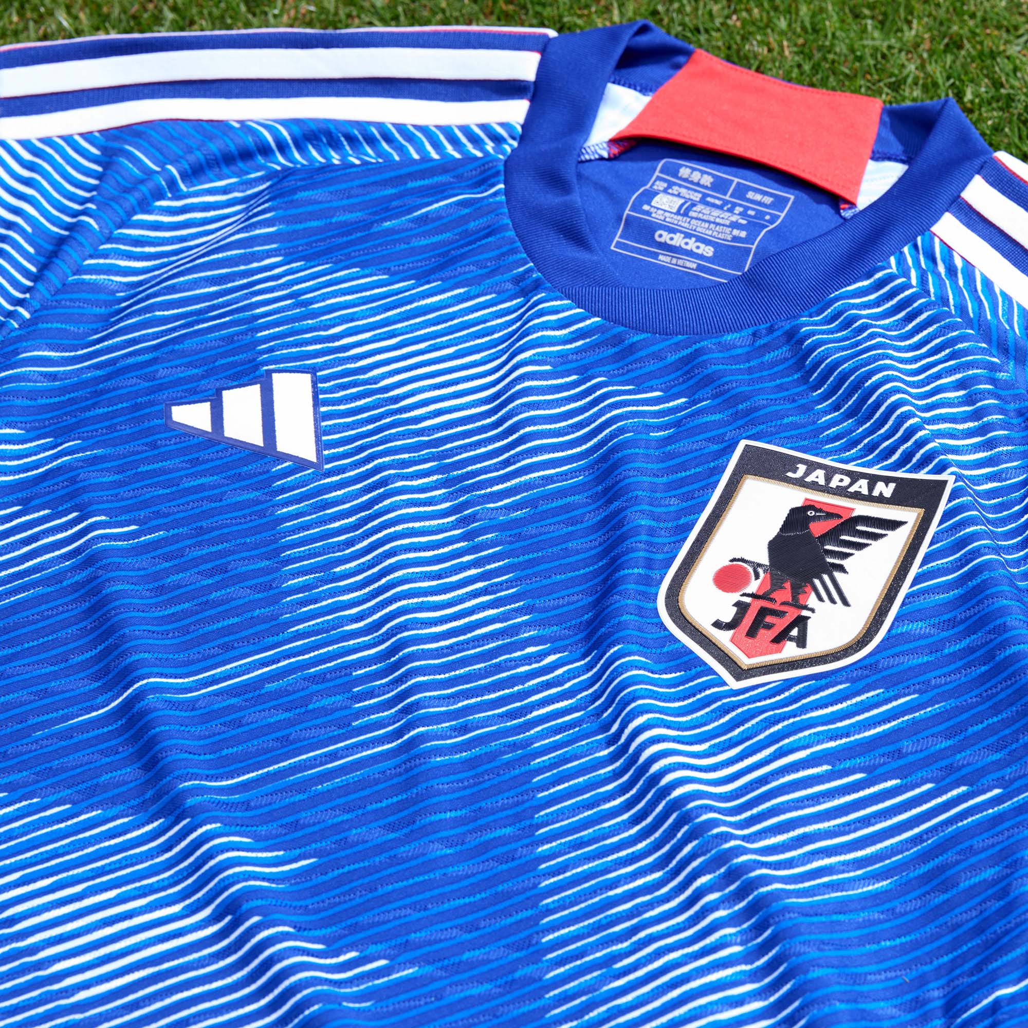
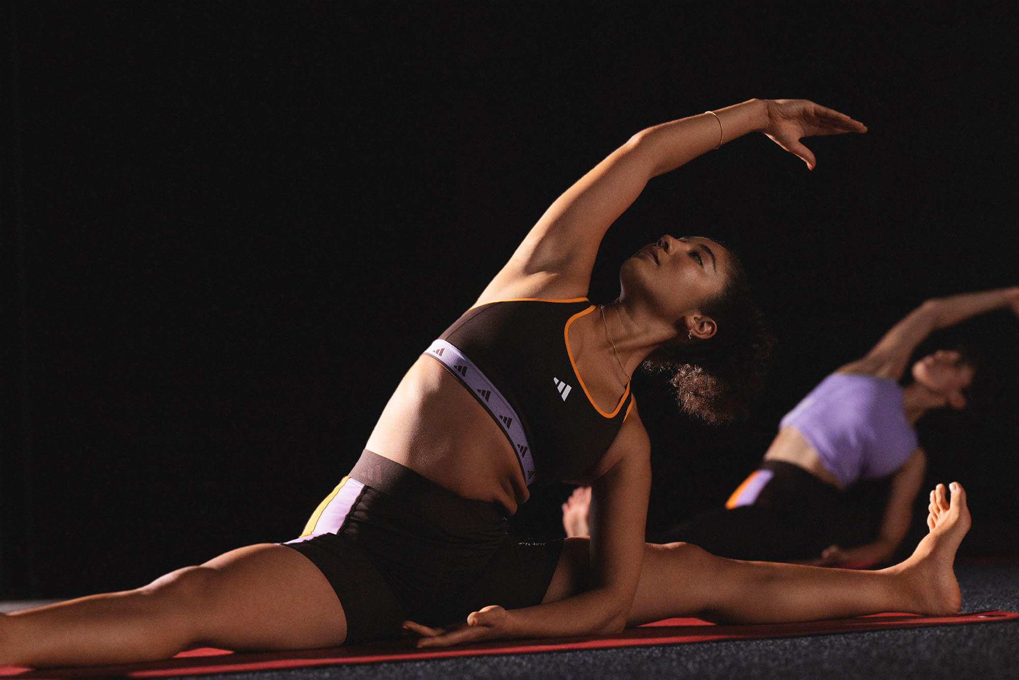
adidas is defined by three distinct brand segments, with the Performance Mark serving as the unifying core across all three. As the central element of the brand, the Performance Mark also represents a wide range of sports and initiatives, from global football and outdoor to running and training. Given its multifaceted use, it was essential to simplify the Performance Mark to be adaptable to any sport or initiative while still maintaining its status as the anchor of the brand.


Refine not reinvent.
The starting point for the redesign was the Badge of Sport, originally created by legendary designer Peter Moore in 1991.
With a 2:3 aspect ratio, the Badge of Sport required meticulous fine-tuning to achieve perfect alignment and proportion with the adidas wordmark. When the wordmark is simply just removed, these proportions start to fall apart. At smaller scales, the first stripe becomes disproportionately small and visually gets lost. The overall lack of contrast causes it to appear more like a wedge from a distance, especially on screen.
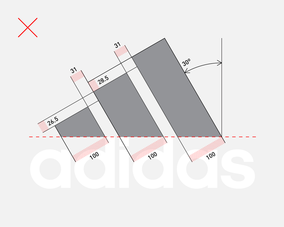
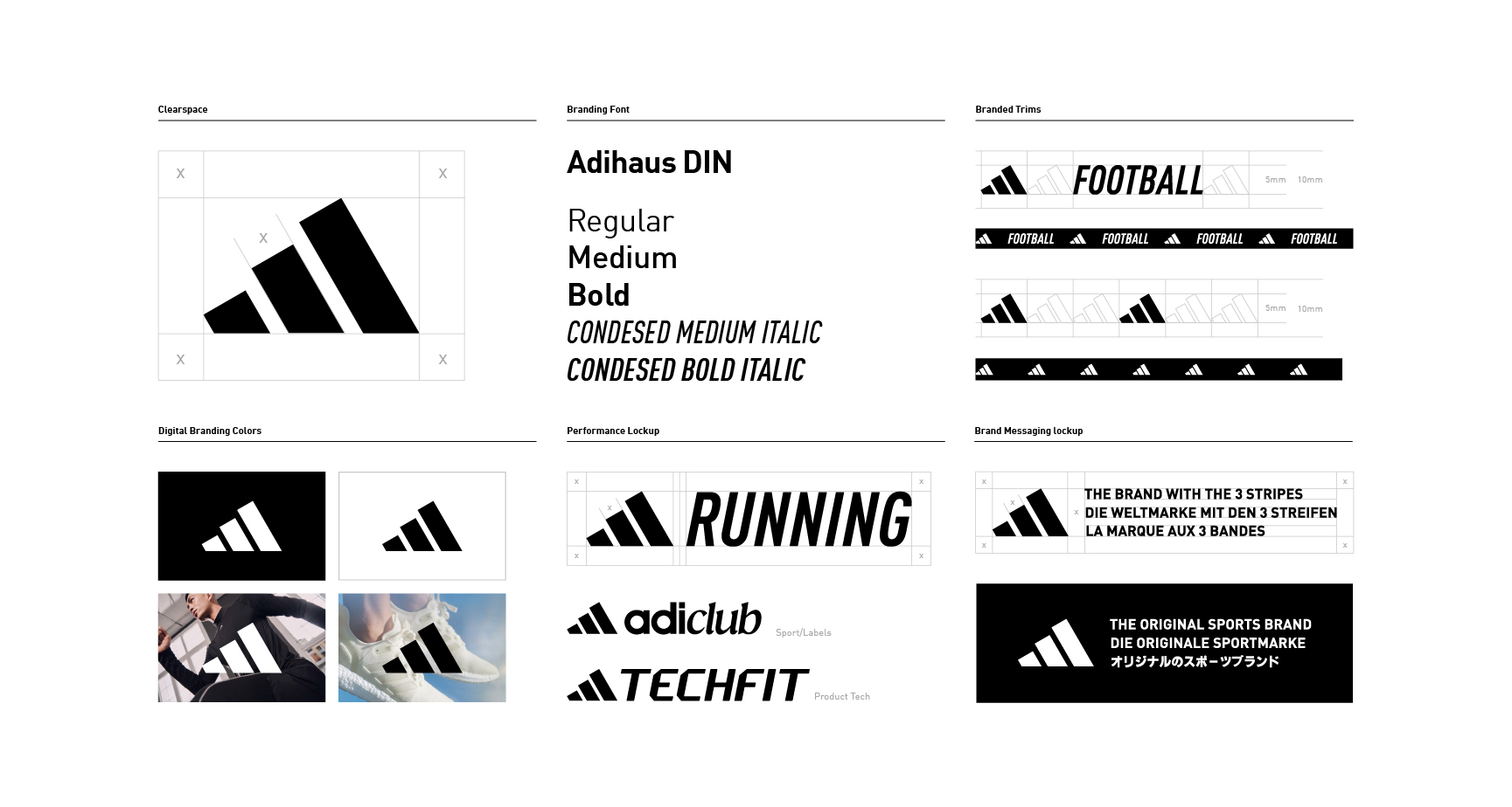
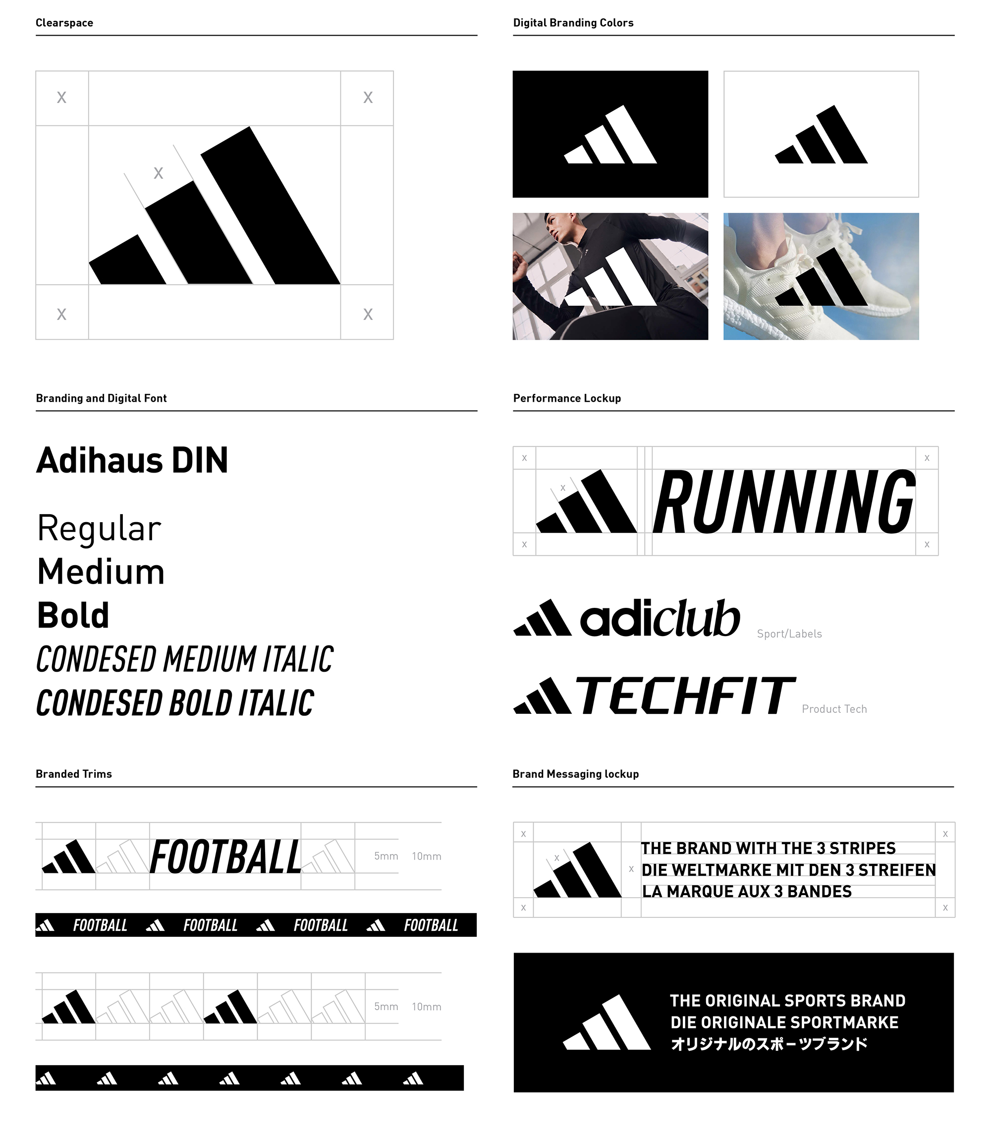
To address these issues, a better size and scale relationship was established using the rule of thirds. The overall height was increased to add more volume to the first stripe, ensuring visual proportionality, and also allowed for more contrast to each stripes height. Additionally the spaces between the stripes were slightly increased to improve scalability. Through these refinements, the Performance Mark maintains the iconic 30º angle. These adjustments enhance visibility and legibility, allowing for better recognition and usability across various applications and screen sizes.


Design Support: Claire Loren, Chris Erickson Photography: adidas Global Brand Design Video: Emily Maye, adidas Global Brand Design Ops: Chelsea Miller, Bridget Zadoff
©2023
©2023